UI/UX Design
Research, wireframes, and polished interfaces that help users finish tasks faster — and call support less often.
Research, wireframes, and polished interfaces that help users finish tasks faster — and call support less often.
Pretty screens that confuse users cost you signups, retention, and support hours.
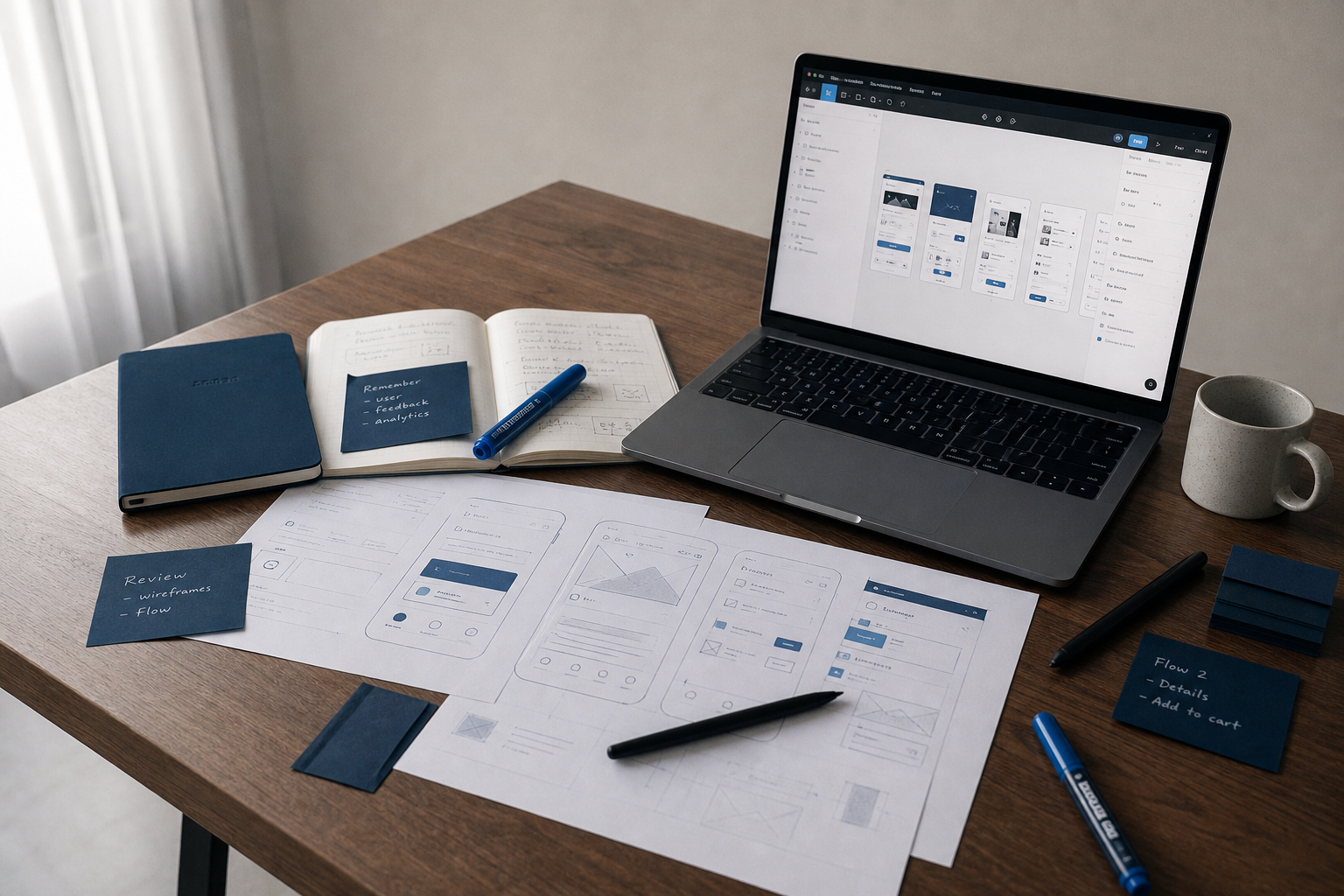
We design products from the task outward — who arrives, what they need to accomplish, where they get stuck. User interviews and analytics inform wireframes before visual styling begins. Prototypes go in front of actual users early, while changes are cheap. The output is a coherent interface system your development team can implement without guessing spacing, states, or error copy. Design and engineering stay in the same conversation so Figma does not diverge from what ships.
Full product redesign or a focused checkout flow — we tailor the deliverables to what moves your metrics.
Interviews, journey mapping, and analytics review to surface friction points your team has learned to live with.
Navigation structures, content hierarchy, and labeling tested so users find features without opening the help center.
Low-fidelity flows for fast iteration, then clickable prototypes validated with target users before visual design starts.
High-fidelity screens with consistent typography, color, and component states across desktop, tablet, and mobile breakpoints.
Reusable components, spacing tokens, and documentation so new features ship looking like the rest of the product.
Moderated sessions, WCAG-oriented audits, and revised flows based on where participants hesitate or abandon tasks.
You see working prototypes before brand colors get finalized. That order prevents expensive rework downstream.
We document user goals, success metrics, and constraints with your product owner. Out of scope gets written down too — so the sprint stays focused.
Wireframes cover happy paths and error states. Five-user test rounds catch navigation dead ends while changes cost an hour, not a sprint.
UI styling follows an approved flow — typography, color, motion. Components map to your existing brand or a defined system we build alongside engineering.
Annotated Figma files, redlines, asset exports, and a walkthrough with developers. We stay available during implementation for edge-case questions.
We spot these in the first review call. Fixing them early is always cheaper.
High-fidelity mockups of the wrong flow just make stakeholders harder to convince when testing fails. We prove the path first, then make it beautiful.
Board-ready screenshots ignore empty states, bulk edits, and permission errors. We design the boring screens because that is where retention lives.
Designers who never talk to developers produce specs that get reinterpreted. Our designers sit in technical reviews so spacing and states survive implementation.